从街上,俯瞰着陡峭的斜坡处 住宅 ,对它所代表的,房子是几乎不可见的,几乎是隐藏在一行灌木。这第一印象不是偶然的:经验,跟着去解释这样一个谨慎的方法。除非你留恋,你通过金属大门在倾斜的平台,标志着街道和房子的入口之间的过渡,并推门进入,都是关闭的空间,没有对外开放。你发现自己四周的墙壁,地板和天花板都在同一个浅色的混凝土,在一个狭窄的走廊,狗的腿在一个直角。有一些门,都一样,都闭上,空间是点燃节制两天花板灯。经过短短几步又在走廊通往楼梯走到一个较低的水平,仍然没有看到外面的可能性。走廊似乎风成的楼梯,因为如果你要进入一个洞穴,你失去了你的轴承。在底部的步骤,你将打开另一扇门对你很惊讶。在你面前是一个宽敞的房间充满阳光。有四个大的矩形窗口,所有的大小相同,它显示四张不同的图片有四个基本点。他们是两个对立:在湖的全景,旅行到了距离,面对它,一个特写镜头的路堤边坡;再加上两个截然相反的看法到花园,与现场点深度。这是房子和四张客厅使它像四周开亭。安排不可避免地会让人想起一个日本的茶馆,或某些意大利别墅等,该别墅的脉泽为例,所面临的,在相同的景观水平,在平原农业和一个莲花池,奠定了山坡上的特写镜头远景。
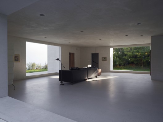
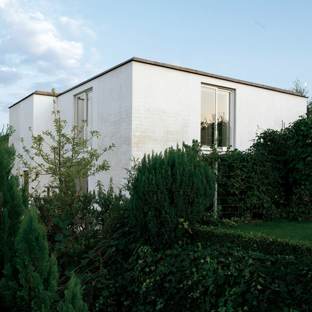
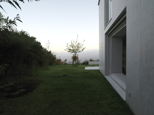
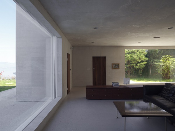
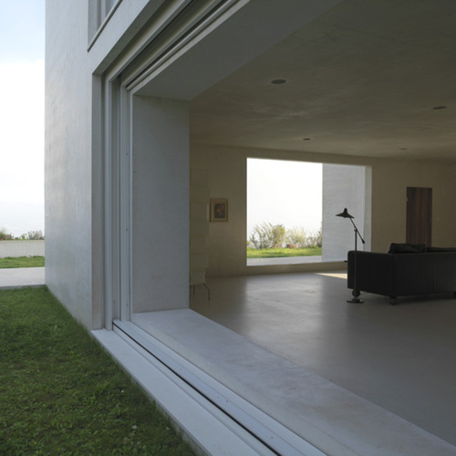
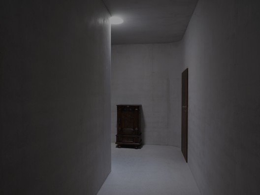
From the street that overlooks the steep-sloping site on which it stands, the house is barely visible, almost hidden behind a line of shrubs. This first impression is not accidental: the experiences that follow on after going in explain such a discreet approach. Unless you linger, you pass the metal gates on the sloping terrace that marks the transition between street level and the entrance to the house, and push the front door to enter into a space that is all shut in, with no opening towards the outside. You find yourself surrounded by walls, floor and ceiling all in the same light-coloured concrete, in a narrow corridor that dog-legs at a right angle. There are some doors, all the same, all shut, the space is lit sparingly by two ceiling lights. After just a few steps the corridor turns again before leading to stairs going down to a lower level, with still no possibility of seeing outside. The corridor seems to wind into the stairs, as if you were going down into a cavern you lose your bearings. At the bottom of the steps, you push open another door to your utmost surprise. There before you is a spacious room filled with light. There are four large rectangular windows, all the same size, which display four different pictures from the four cardinal points. They are set in opposition two by two: a panorama over the lake, travelling into the distance, and facing it, a close-up of the embankment slope; plus two diametrically opposed and different views onto the garden, both with little depth of field. This is the living room of the house and the four pictures make it like a pavilion open on all sides. The arrangement inevitably calls to mind either a Japanese tea house, or certain Italian villas, such as the villa Maser for example, which confronts, on the same sight-level, a distant view over an agricultural plain and a close-up view of a lily pond laid out on the hillside.
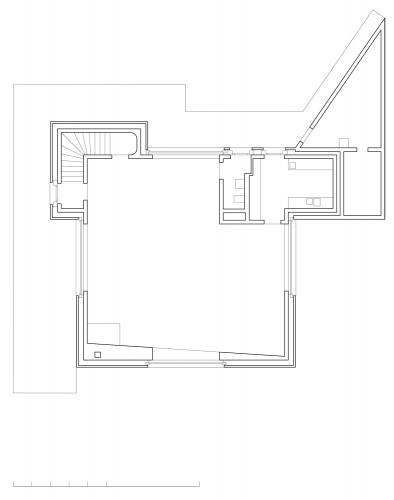
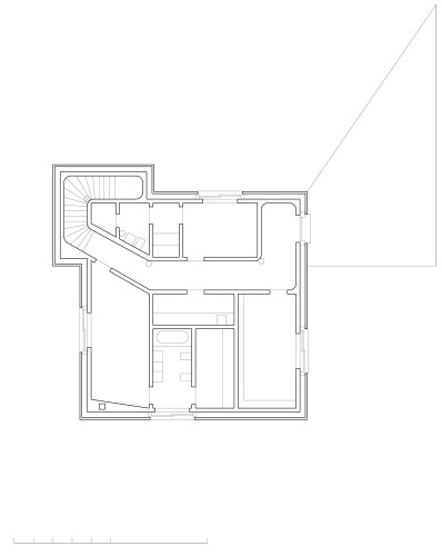
Even though the four windows are not exactly opposite one another, the void of their openings accentuates stability of space. What is more, the living room is not a perfect square: one corner is filled by an opaque volume that contains service premises – toilet and kitchen. Does this result from imperatives of function or from some other reason? In other words, what would happen if the service premises volume did not intrude so violently into the room, if it was not shoved in like a wedge? Similarly, what would happen if the right-angle volume of the stairs did not butt up against the other corner, as if to form a counter – weight to the brutal thrust of the services volume?
Without these two intruding volumes, the living room would be all walls and windows, and the walls would be fragile, like surfaces folded at right angles. In fact, the two intruders give the living space solidity; they indicate and make us aware that we are not only in a room, but that this room is part of a larger organism that forms a unity, a whole. This is a prime concern for Valerio Olgiati in many of his projects. It is in this dimension that the house finds its force, its intensity, and even its excess.
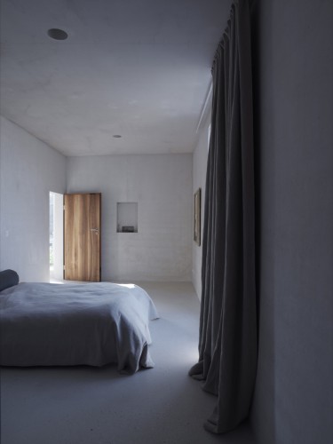
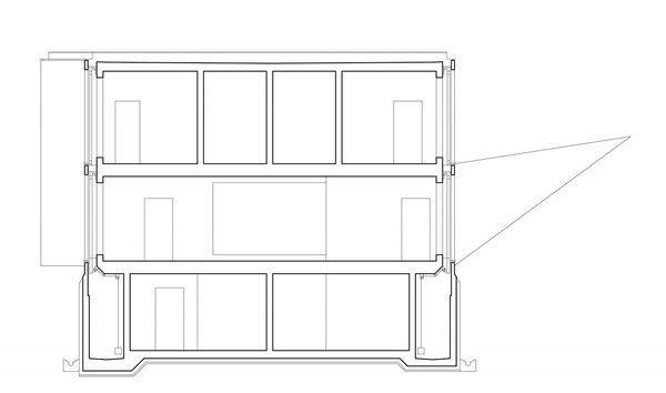
Everything derives from the initial choice of dealing with unity and continuity. The house is designed as a shell and not as an assemblage of walls, floors, uprights or partitions. Indeed, there are no partitions, since all interior walls are made of the same thickness of concrete, from the bathroom walls to those of the dressing chamber and bedrooms or kitchen volume: which is one way of saying that every house is in fact potentially a single room, no matter how small, just as the room is an inseparable part of the organism formed by the house, unable to be dissociated from it. In other words, everything is indivisible, all is unity.
To emphasise these characteristics even more, the shell is built as a block which of course represents something of a feat in construction technology and explains the exorbitant costs. From floor to roof, surfaces are continuous and uniform, whether horizontal or vertical; they are made of the same light-coloured concrete that is everywhere apparent and that makes the house a monochrome. There is no expression of a skeleton independent from the envelope; the frame is one and all: it does not belong to the reign of the vertebrates, but to that of the crustaceans. No joins are marked, most are invisible. And to stress the house’s monolithic character even further, the four windows of the bedroom and office floor are all positioned either on the vertical, or offset with regard to the four large horizontal windows of the living room. As for non-structural parts, they too express overall unity: there is one type of timber used for all the woodwork; interior doors appear as the same wooden rectangle, with no subdivisions; in the living room you have one window repeated four times, with a single pane, no subdivisions there either; and so on. Interior doors are not made as they are traditionally of two parts, a jamb and a leaf, but of a single opening leaf The putting together of different materials does not suppose that they are articulated or even assembled: certain elements are simply hung from the shell, but most slip into it as into a container.
The description of the house that I have given is sense-related, you might say it is a phenomenological experience. This experience is of course visual to begin with: the eye is caught by mass and compactness, by contrasts of atmosphere and light, by differences between main spaces bedrooms, office, living room. But these contrasts and differences never break up the whole, they never dissolve it; on the contrary, they reinforce it and make it a real organism. The experience is sound-related too. When you come into the house, in the corridor with its shut doors, silence settles and the sounds of footsteps or voices are muffled. On the stairs, this silence accentuates the feeling of going down into a place like a crypt or a cavern. In the living room though, voices ring clear, as if to salute the full light found again. The experience may also be of another order: in fine weather, all four living room windows can be opened, retracted into the floor. This turns the space even more into a pavilion open to all four cardinal points, open to the four winds. You feel all the more intensely then the contrast between the solidity, immobility, perennial reality and lightness of the building, its fluidity and evanescence in the air. And between what remains and what passes too: the real idea of a house.
Architect: Valerio Olgiati
Location: Zurich, Switzerland
Project Manager: Pascal Flammer
Construction Supervisor: Peter Diggelmann, Archobau AG, Chur
Structural Engineer: Patrick Gartmann, partner of Conzett, Bronzini, Gartmann AG, Chur
Project Area: 520 sqm
Project Year: 2003-2005
Photographs: Courtesy of Valerio Olgiati
