博物馆的初始部分,也就是后来人们所熟知的国家美术馆西馆是由艺术品收藏家安德鲁·梅隆资助的。20世纪30年代后期,建筑师约翰·拉塞尔· 波普受雇设计这座博物馆,他在设计之初就为建筑未来的扩建预留了空间。
What would eventually become known as the West Building of the National Gallery of Art, the initial portion of the museum was financed by art collector Andrew Mellon. Architect John Russel Pope was hired to design the museum in the late 1930s, with the intentions of leaving space for future additions.
数年之后,梅隆的儿子保罗负责为博物馆的扩建挑选建筑师。他转而找到了在20世纪具有前瞻性的建筑师——贝聿铭。
Mellon’s son Paul had the responsibility of choosing the architect for the expanse years later, so he turned to one of the most forward-thinking architects of the twentieth century,I.M. Pei.
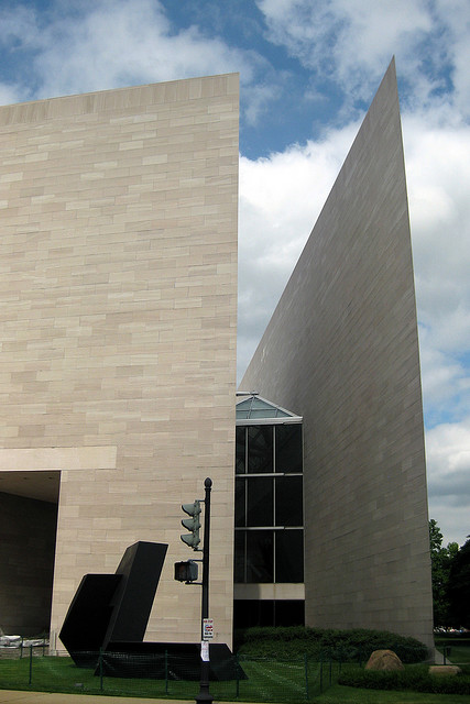
对于贝聿铭来说,有两个突出的因素导致设计变得非常棘手,那就是建筑的外形和功能。为建筑预留的狭小的梯形场地使人不知从何入手。北侧呈一定角度的宾夕法尼亚大道限制了场地的范围,使场地的外形十分奇怪。南侧的国家广场也给设计师造成了同样的困扰。
The two most prominent aspects of the project that made the design challenging for I.M. Pei were the buildings` form and function, as the small trapezoidal plot that was reserved for the building created a difficult site to design on. Pennsylvania Avenue which was at an angle to the north side created a strange limit, as did the proximity of the National Mall to the south.
此外,相邻的场地包含在总统的就职活动路线中,这也限制了建筑的场地。但是设计的重中之重就是建筑要与国家广场的宏伟规模相匹配,同时又要与既有的西馆新古典主义的风格相协调。
These building limits were also restricted because the adjacent land was marked as the President’s inaugural route. But the most demanding part of the design was that it needed to fit in with the monumental scale of the Mall while also harmonizing with the already-built neoclassical design of the West Building.
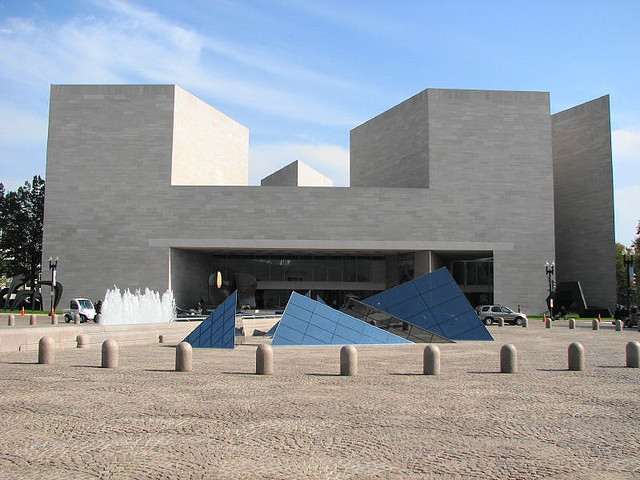
在研究了场地的形状后,贝聿铭采用了与梯形场地结构相呼应的建筑形式。在首次与贝聿铭
就场地问题进行讨论的时候,他说自己“首先用一条对角线将梯形分为两个三角形。这就是设计的开始。”第一个三角形是等腰三角形,它将容纳展览空间。第二个三角形是直角三角形,它将容纳行政办公室、一座图书馆和艺术研究学习中心。
In attempts to work with the shape of the site, Pei implemented forms that reflected the trapezoidal form. When the plot was initially discussed with Pei, he explains that first he “sketched a diagonal line across the trapezoid and produced two triangles. That was the beginning.” The first triangle, an isosceles, would contain the exhibition space, and the second, a right triangle, would accommodate administrative offices, a library, and a study center for art research.
等腰三角形成为了贯穿建筑始终的母题,从大理石地板、钢框架到玻璃天窗,都能找寻到它的踪迹。建筑的六边形电梯和梯形办公桌也重复应用了锐角三角形和钝角三角形图案。
This isosceles triangle became a unifying motif of the building, found in the marble floors, steel frame, and glass skylights. These acute and obtuse angles are also repeated in the building’s hexagonal elevators and trapezoid-shaped office desks.
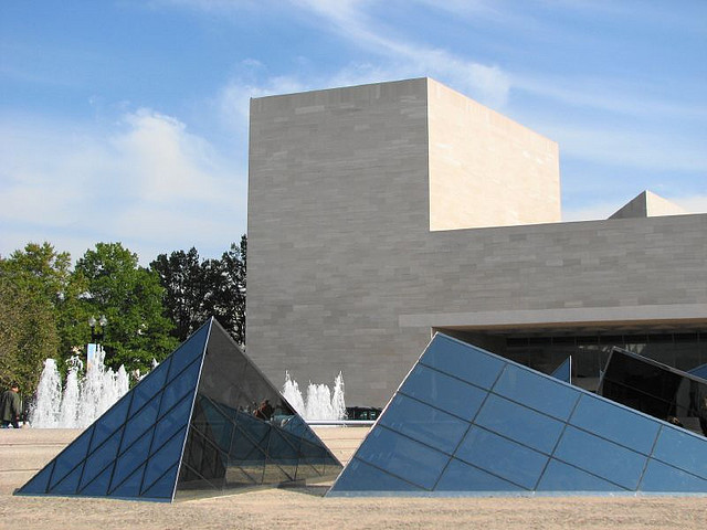
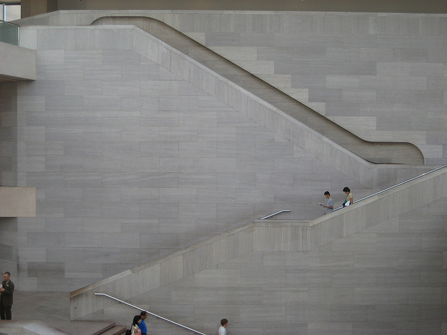
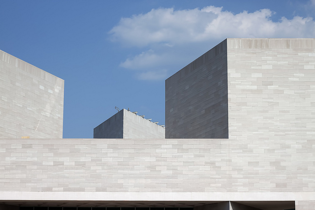
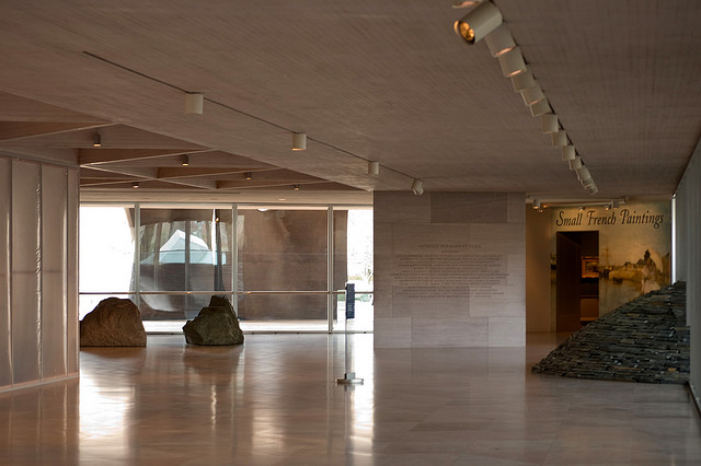
西馆的特点是平衡和对衬,为了在视觉上与这种新古典风格保持统一,容纳当代艺术品的东馆的外立面采用了同样应用在其他建筑中的淡粉色Tenesse大理石。室内墙体由同种石材的粉末与混凝土的混合物装饰,颜色优美大方。
This isosceles triangle became a unifying motif of the building, found in the marble floors, steel frame, and glass skylights. These acute and obtuse angles are also repeated in the building’s hexagonal elevators and trapezoid-shaped office desks.
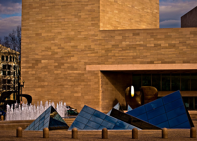
第二个统一的要素就是强有力的轴线连接。东馆的主入口通道与西馆的东西轴线相交,在两座建筑间构建了一座小广场。小广场借助大理石铺地材料和玻璃金字塔等元素与其他区域区分开来。玻璃金字塔与东馆的框架天花板相呼应。这些玻璃金字塔就此成为了贝聿铭博物馆设计的标志。
To visually unite the neoclassical style of the West Building, characterized by balance and symmetry , and the East Building which houses modern art, Pei constructed the exterior of his building with the same pink Tenesse marble used in the other building. Dust of this same marble was mixed with concrete to create the beautiful color of the interior walls.
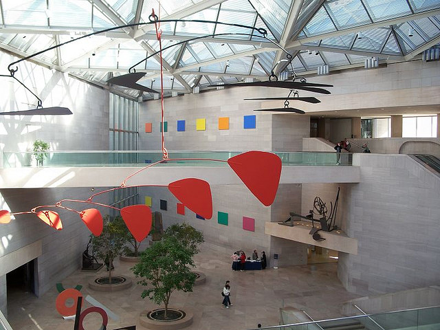
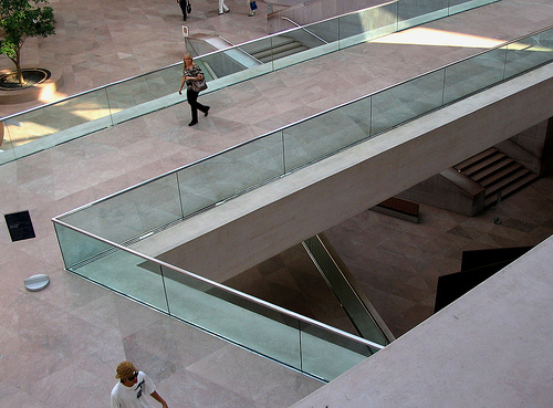
室内有一个大型的中庭,十分开阔,引得游客举目仰望。他们可以审视整个建筑,毫无局促之感。贝聿铭想要对室外和三角形设计棱角分明的线条进行改造,但是他懂得要用温暖和热情的氛围来软化这些线条才是上策。他设计了大型的圆形花池,以此来中和这些棱角。每个花池中都种植着热带树木,有助于游客在大型中庭内感知空间的开阔。
The interior opens up to a large atrium; the openness of the space invites visitors to gaze upwards and let their eyes travel around the building without feeling overwhelmed. Although Pei wanted to recreate the hard-edged lines of the exterior and triangular design, he realized that it would be best to soften these lines for a warm and inviting feeling. He designed large round planters to counteract these edges, each planter containing ficus trees which helped create a sense of scale in the large atrium.
建筑师:I.M. Pei
地点:美国华盛顿
项目施工时间:1974-1978
摄影师:Patrick Swift, Victoria Pickering, Phillip Capper, Bill Shields, Wally Gobetz,Flickr: username- Andy961, Flickr: username-mmwm
参考文献: National Gallery of Art, Phillip Jodidio
项目来源: I.M. Pei


